Benefi Global
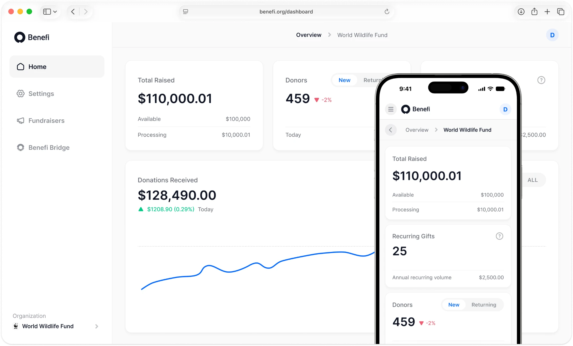
A platform that makes charitable giving simpler, more transparent and more accessible. As the sole product designer at an early-stage startup, I took it from 0 to 1: first the iOS app, then the web platform and a design system shared across four products.
- Role
- Sole product designer
- Scope
- 4 products, 1 design system
- Domain
- Nonprofit
- Live product
- Visit site ↗

Overview
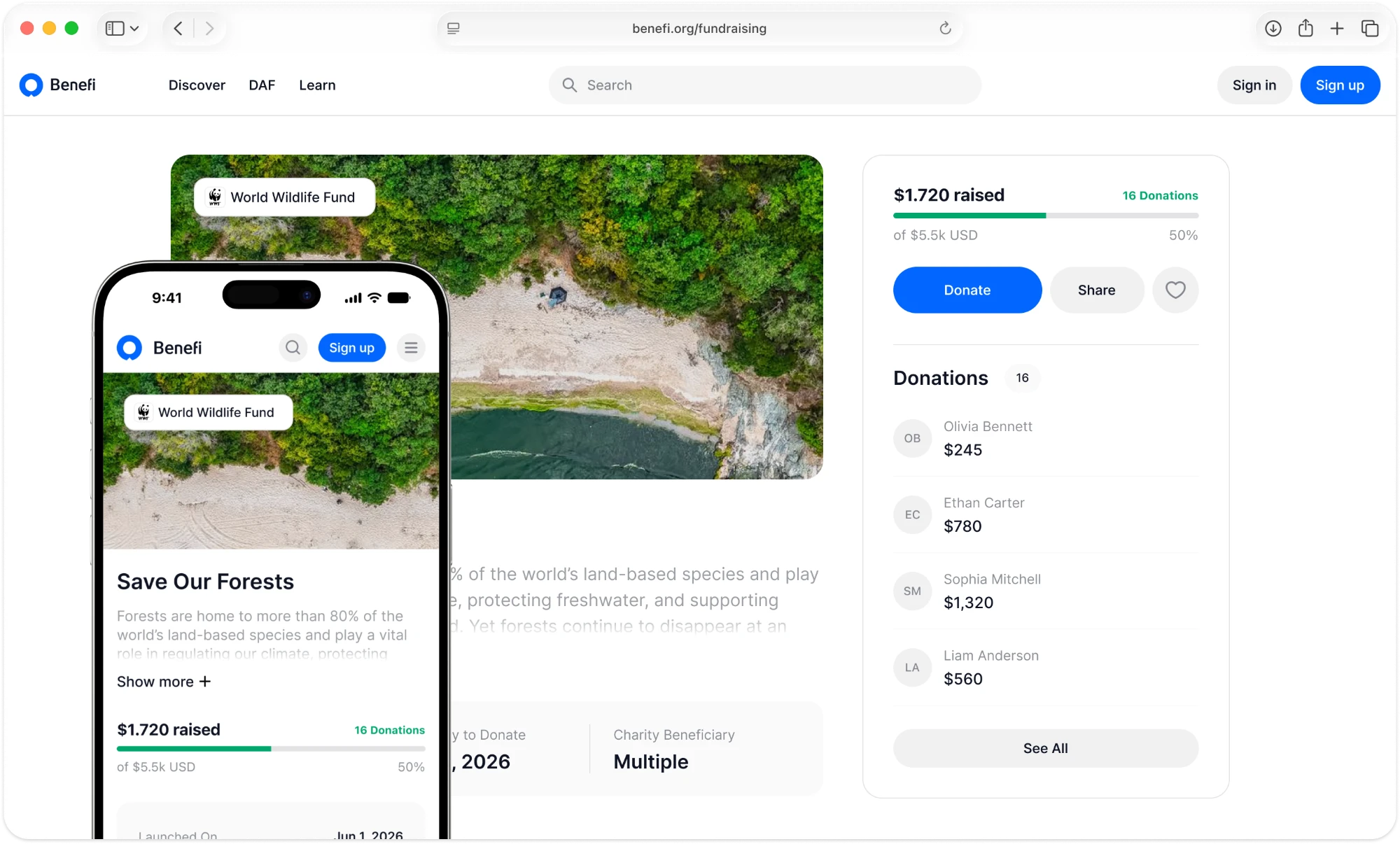
Benefi brings charities and nonprofits working across many different causes into one place. People can discover organisations, explore their missions, compare their results and transparency, and find the most effective ways to support them. This case covers how I designed the iOS app end to end and then grew it into a cross-platform product built on one design system.
Problem
One of the main goals was to make the platform and everything that happens in it clearer, faster and more trustworthy. Early research showed three problems standing in the way of anyone who wants to give.
- Too many organisationsThere are so many charities that it is hard to choose the right one.
- Scattered informationData about charities lives in different places, so comparing them is difficult.
- Impact is hard to judgeIt is unclear whom to trust and where a donation will do the most good.
Process and solution
The goal was to turn finding a charity from a scattered, complex search into a simple, intuitive and trustworthy experience.
- DiscoverAs the sole product designer at an early-stage startup, I owned the full UX/UI cycle for iOS, from 0 to 1. I started by identifying the business needs and researching the market, which defined the goal and the problems the product had to solve.
- Shape the home screenThe home screen took the longest: at first it was not clear what users expected to see there. To find the direction, I ran a competitive analysis, hallway testing and user interviews. After several iterations, I settled on a clear order of blocks:Hero banner: the entry point at the top of the screen.Most popular charities: placed first so newcomers can start with the most trusted organisations.Trending charities: organisations that are gaining attention right now.Nearby: a feed of organisations close to the donor.
- Scale with a design systemLater, a web version of the platform joined the roadmap. To speed up work on new screens and keep the experience consistent across platforms, I built a flexible design system that covers both iOS and web and can scale to more products.
- Design & testOnce the base of tokens and components was ready, I designed adaptive interfaces based on the information architecture and user flows I had created. Usability testing guided each iteration and helped make the product easier to use.
Key results
Benefi turns a scattered search across many sources into one place where people can find a charity, understand its impact and support it with confidence. The iOS app and the web platform share one design system: new screens are built from ready tokens and components, and the experience stays consistent across platforms and products.