Clique
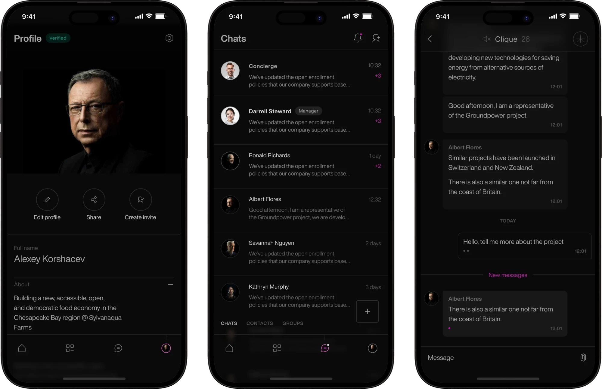
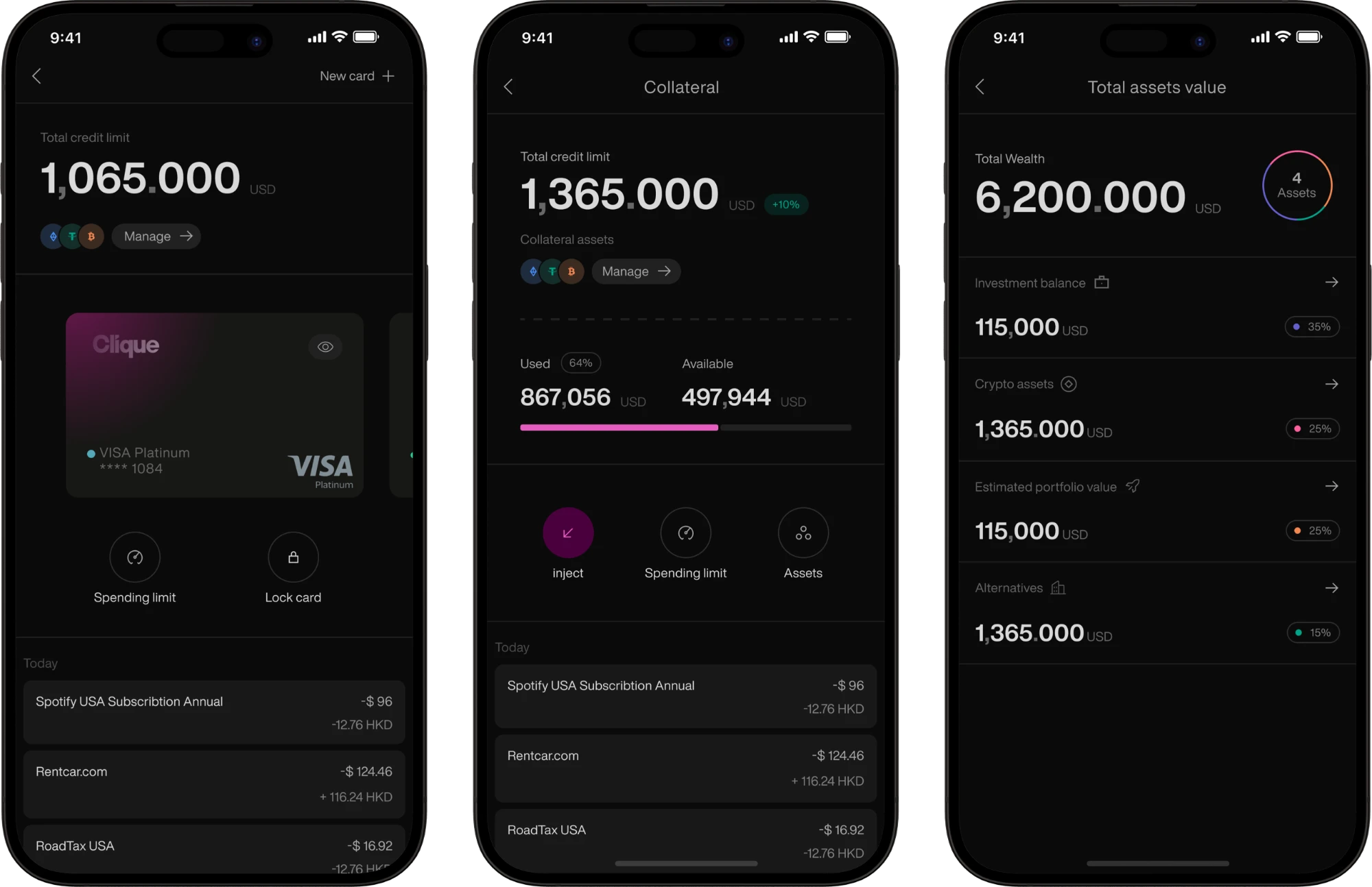
An exclusive banking service with personal financial solutions for wealthy clients. Its signature is a high-touch service that monitors and looks after their assets, alongside investing and a personal concierge. I redesigned the UX and UI of its iOS and Android app, from research to a new visual system.
- Role
- Product Designer
- Scope
- iOS & Android, Design system
- Domain
- Private banking
- Live product
- Visit site ↗
Overview
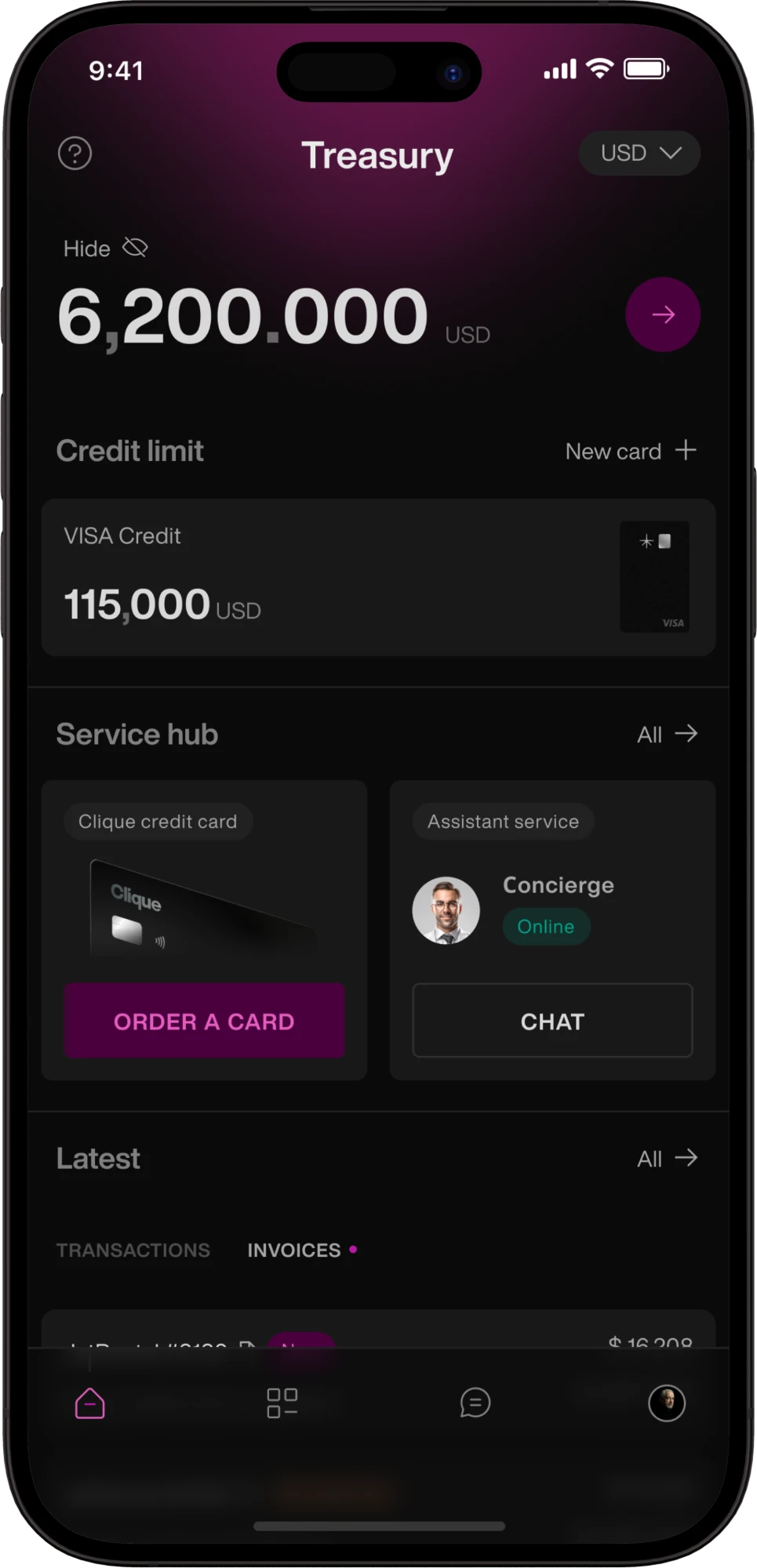
Clique is a private digital platform for entrepreneurs, wealthy families, family offices, private investors and clients interested in alternative assets. It brings together asset management, private investment opportunities, payments and invoices, a concierge, a private network, direct contact with the Clique team, and lifestyle, travel and luxury services. This case covers how I turned all of this into one mobile product.
Problem
Clique is not mass-market fintech: its clients do not need a handy app to send $50. They want to see and control their whole wealth ecosystem and reach the right people, opportunities and services, so the app has to feel like a private club or a personal financial OS rather than another Revolut.
- Premium service, ordinary appThe service is built around private wealth and a personal concierge, but the app felt like any other banking product: premium human service, ordinary digital experience. The redesign had to make it personal, premium, trustworthy and effortless, and keep everything a financial product needs to do.
- Disconnected scenariosPeople open Clique for very different reasons: to check a portfolio, explore an investment, pay for something, ask the concierge or connect with someone. If each scenario lives on its own, the product starts to feel like a set of services rather than one ecosystem.
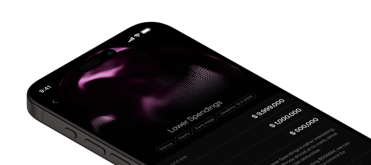
Process and solution
I focused on turning asset management, lending, concierge services and everyday banking into one calm, premium mobile interface. One question guided the work: “What should a banking app feel like when a user has $60.2M+ in assets?” The research answered it with four principles: Clarity, Privacy, Speed and Control.
- UnderstandI studied the audience, the market and existing financial products to map the key scenarios and expectations. In closed interviews with potential users, I explored how wealthy people relate to financial information, investments, privacy, concierge services and everyday operations. The research showed that the number of features is not the main advantage here. What matters far more is understanding the state of your assets at a glance, acting safely and always feeling in full control.
- DefineI turned the insights into four principles. They became the foundation of the redesign and the criteria for every UX decision that followed.Clarity: complex financial data should be clear at first glance.Privacy: sensitive information should feel protected at every step.Speed: key operations should be quick, with no extra steps.Control: users should always know where their assets are, what is happening with their money and what they can do right now.
- Structure & DesignI reworked the information architecture and key flows, from the overall picture of a client’s capital and individual assets to investing, lending, payments and concierge requests, turning scattered banking features into one clear system. Then I designed a new visual system: components, typography, asset cards, financial data visualisation, navigation and interaction patterns. Its language is quiet luxury: minimal visual noise, strong hierarchy, plenty of space and content over decoration.
- Refine & EvolveWith the core system in place, I prototyped the key flows and tested them for consistency, speed and clarity. Over several iterations I refined navigation, information hierarchy and interaction patterns, cutting extra steps and keeping financial and concierge scenarios in one consistent experience.
Key results
- −25%Development time for new features once the design system was in place
- 1Interface for asset management, banking, lending and concierge, instead of a set of separate services
The result is not just a new visual layer but a cohesive mobile system, where wealth management, banking, lending and concierge work as a single, predictable experience. The idea behind the redesign: when managing millions, the interface shouldn’t make you think about the interface. It should simply make you feel in control.