Binomo
An online platform for trading financial instruments, mostly short-term trades on changes in asset prices. It is built for retail traders, with a simple interface for opening trades and following the market. As Product Designer, I owned the trading platform and its design system, from the first concept to the onboarding and deposit flows.
- Role
- Product Designer
- Scope
- Web & mobile, Design system
- Domain
- Trading platform
- Live product
- Visit site ↗
Overview
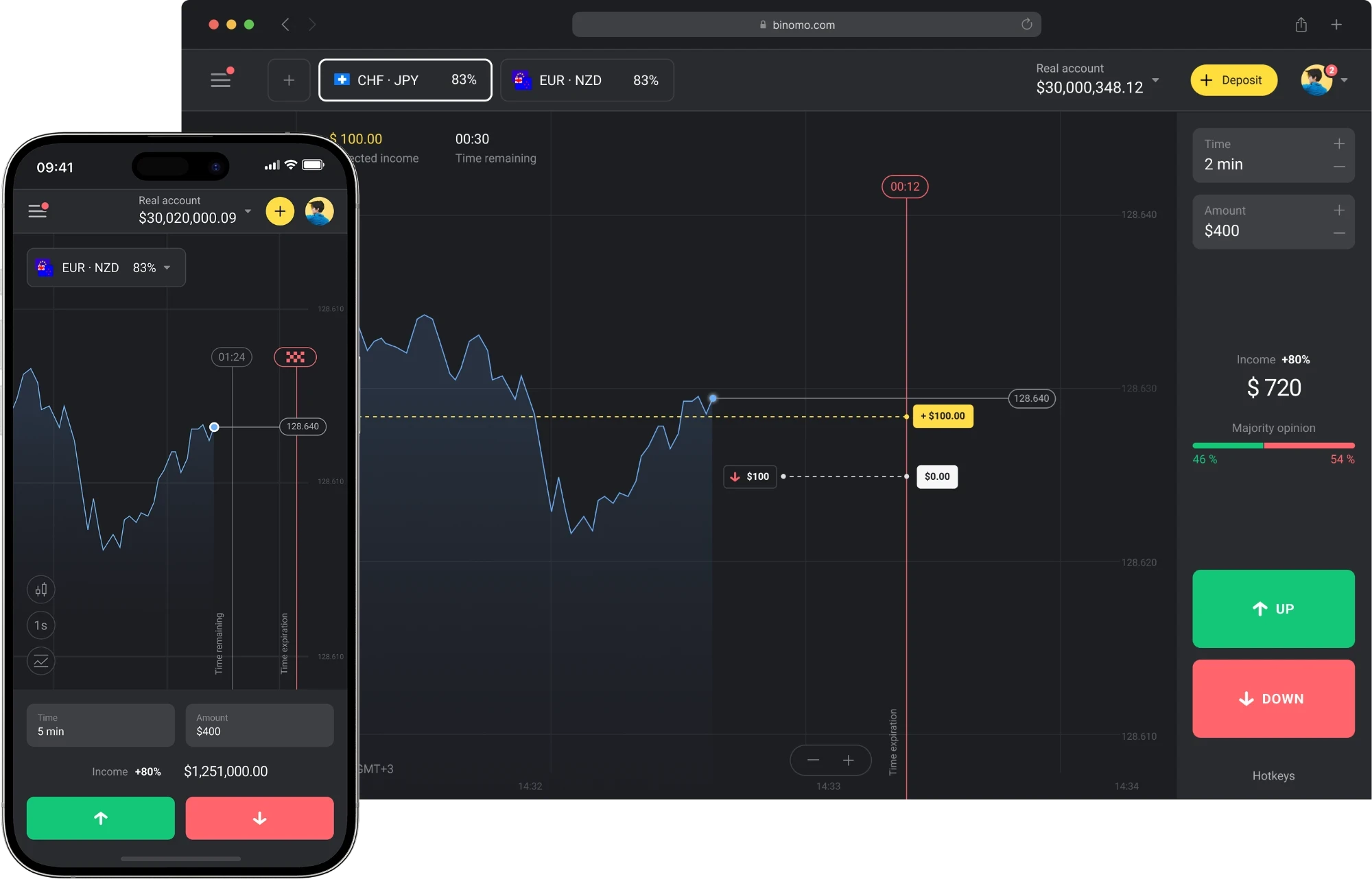
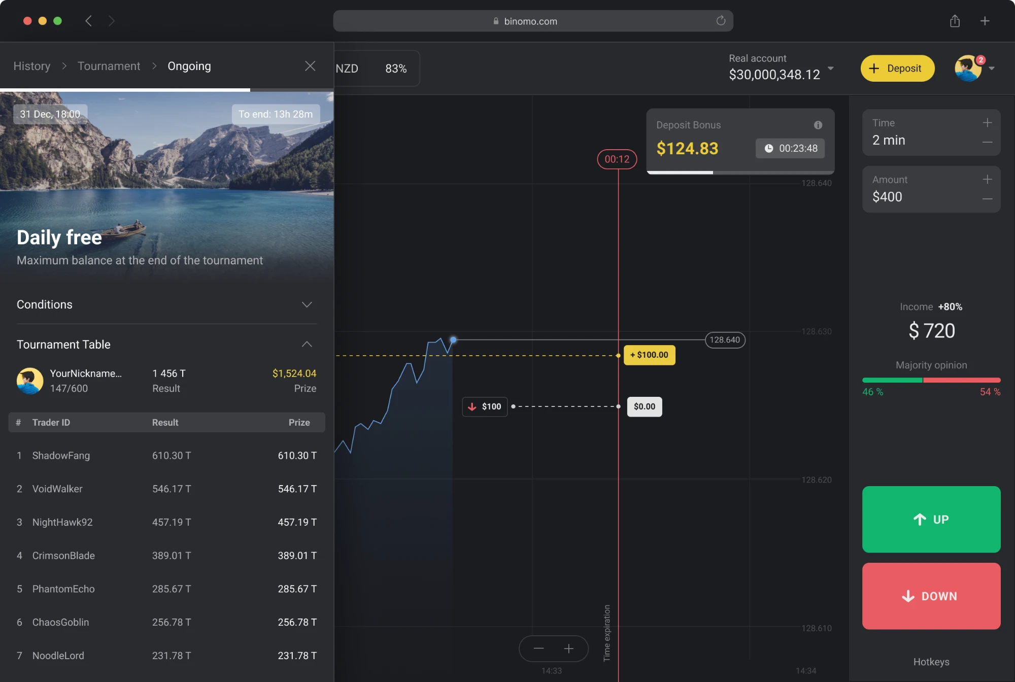
Binomo is a trading platform with an audience of over 1 million unique users a month, most of them newcomers trying trading for the first time. I led the redesign of the core product, starting from a single concept and growing it into a design system, a new onboarding and a rebuilt deposit flow. This case covers how the platform became easier to start with and better at converting new users.
Problem
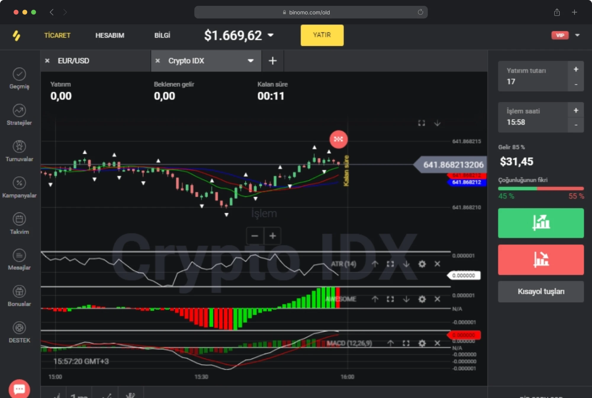
The audience was mostly beginners, but the product was built like a professional terminal. New users signed up out of curiosity and left almost immediately, before they understood how anything worked.
- Steep learning curveDense charts, many buttons and complex controls made the first session overwhelming for a beginner.
- Early drop-off37% of new users left right after sign-up, and user interviews confirmed they did not know where to start.
- Inconsistent, desktop-first UIScreens looked uneven and the platform lacked a proper responsive and mobile experience.
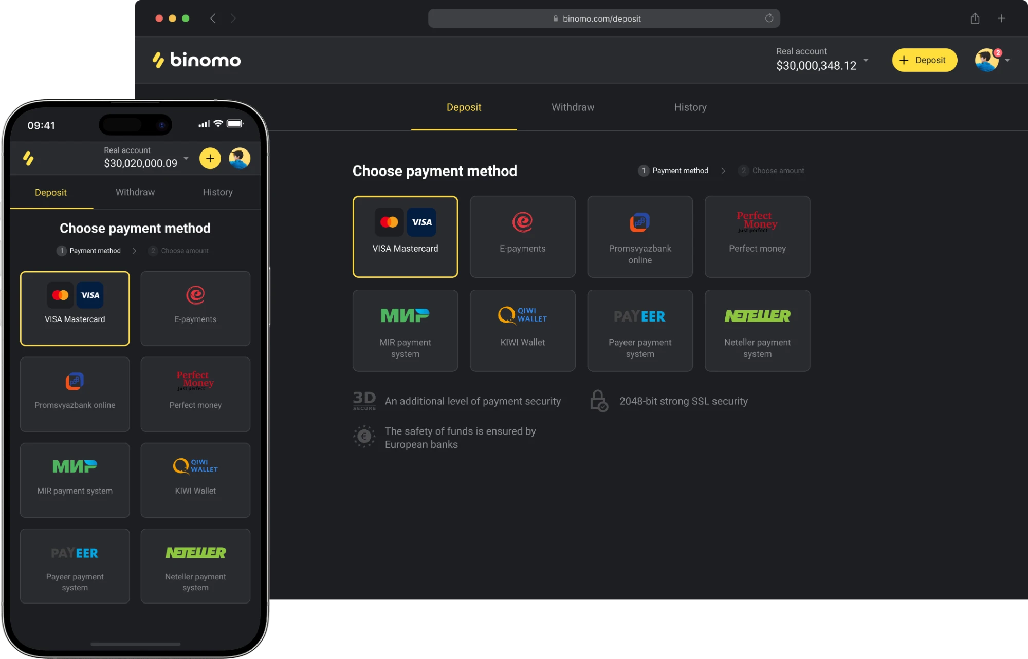
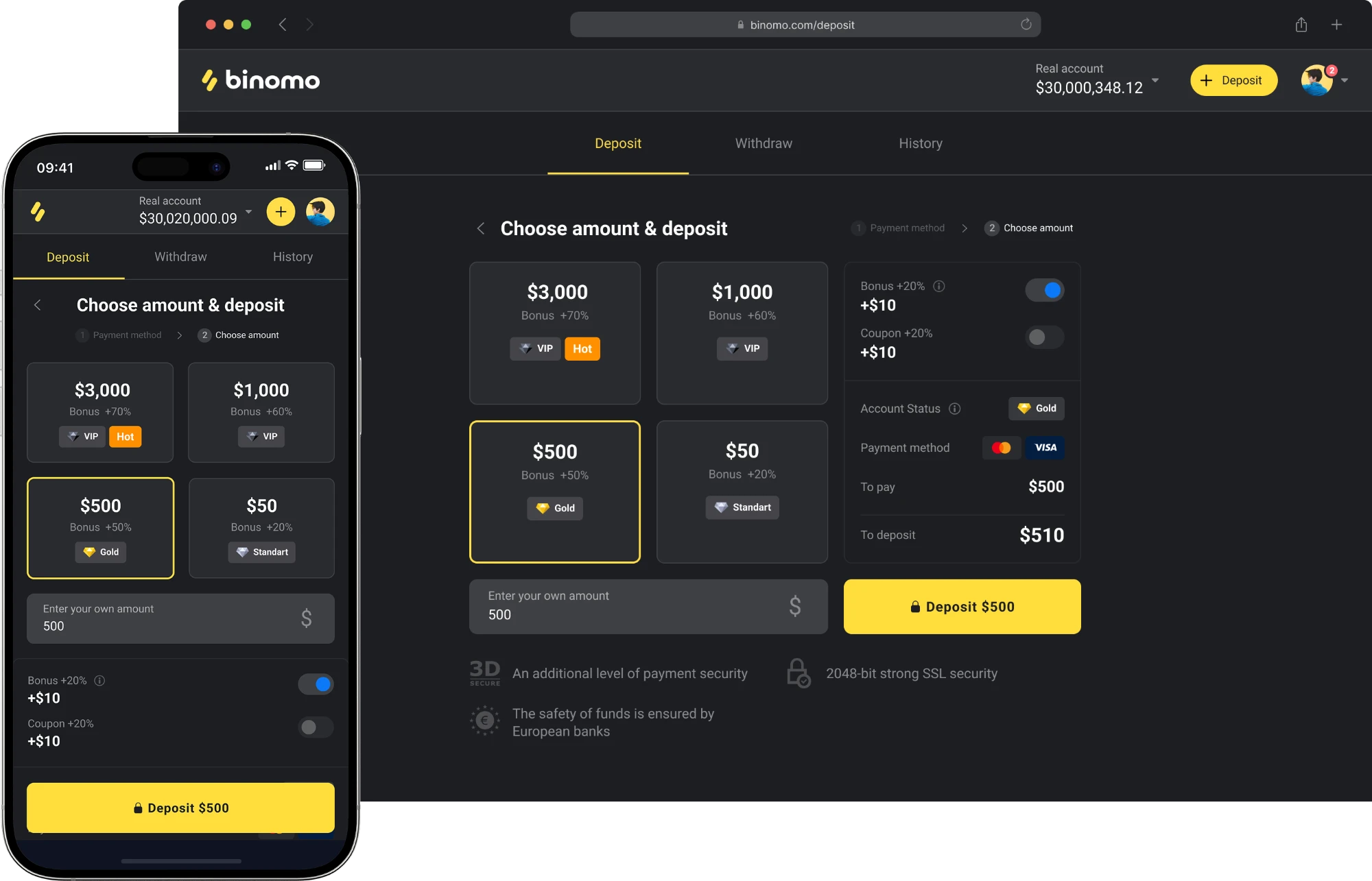
- Outdated deposit flowThe old deposit form was cluttered and no longer fit the product, adding friction at the moment users were ready to commit.
 After
 Before
Process and solution
The work ran in four overlapping phases, from discovery to launch. Research never stopped after kickoff: user and market insights kept feeding each next iteration, from the first concept to onboarding and the deposit flow.
- DiscoveryI started with stakeholder interviews to align on business goals and constraints, then combined market research, user research and competitor analysis to see where Binomo lost beginners and where rivals made trading feel simpler.
- ConceptFrom these findings I shaped a UX strategy: what should set the product apart and which core features a newcomer needs first. I turned it into a concept of the new interface and aligned it with stakeholders, which got the green light to scale it across the whole platform.
- ExecutionI built a design system to keep screens consistent and speed up delivery, then redesigned the web and mobile experience on top of it and worked closely with engineers through implementation.
- LaunchEach release went through QA and UX validation before going live. After launch, user interviews showed that beginners still dropped off after sign-up, which led to a new onboarding and a rebuilt two-step deposit flow in the next iterations.
Key results
- −16%Bounce rate after sign-up once onboarding launched
- −20%Time to develop new features, thanks to the design system
- +15%Deposit conversion of new users compared to the old form
The platform now looks consistent, works on mobile and is far easier to start with. Onboarding kept more newcomers past their first session, and the simpler deposit flow turned more of them into paying users. The design system became the foundation for everything that followed and cut new feature development time by a fifth.